You may have seen Tombstone Brewing Company’s logo on Facebook and Twitter, and maybe even on LinkedIn, but here it is in case you missed it:
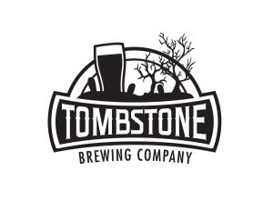
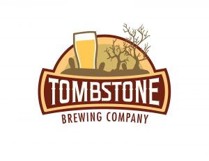
Rick Whipple at Sky Island Studio designed it, and I think he knocked it out of the park. Though I think the black and white version is my favorite, here’s the design in color:
In a largely abstract sense, I’d like to think great beer will sell regardless of the logo. Not to name names, but some popular beers have some terrible logos that don’t seem to slow them down a bit. Plus, consider my law firm’s logo:
![]()
The origin of that was my law firm business partner and I drinking beer and playing around with Microsoft paint. In a stroke of pure genius (mine, I’d like to think), we picked a font that I’m pretty sure was called “lawyer” or “law firm” and then eventually had the epiphany that the “L” fit in the “B” nicely. The rest is history. History that happens to involve a pretty crude logo and a law firm with a terrible name to begin with (though it beats “Little Brown,” which was taken anyway). It didn’t stop that endeavor a bit, though, so the logo for the brewery wasn’t a top priority at first.
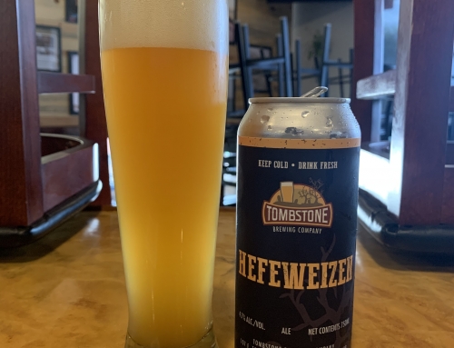
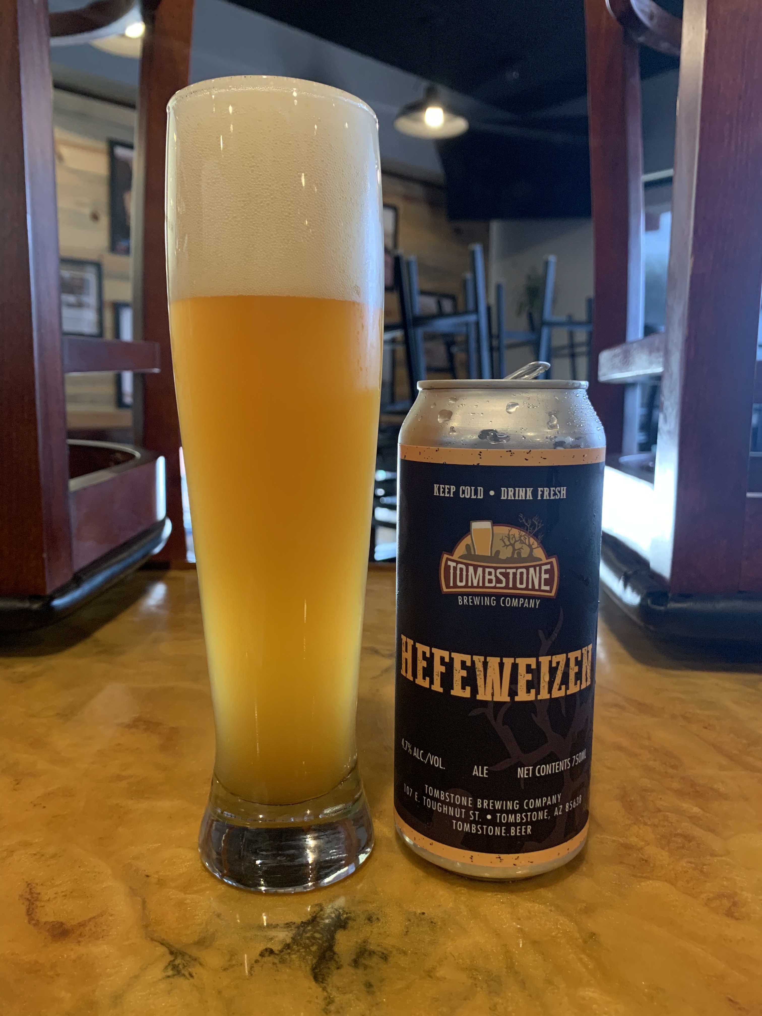
That only lasted until I spoke with people about it. The most important thing seemed to be whether the product would stand out on a shelf filled with other beers, and I certainly think what we’ve chosen does that. A grey can with the logo in black? I’m not sure anything else on shelves would look even close.
Thinking about it in greater depth, the more important thing became the feel that the logo conveys. There are some very retro brewery logo designs that convey a sense of a time-honored tradition. There are ones that take themselves very seriously, coming off more like something that would go on a bottle of expensive wine. Beer labels run the gamut from cartoon to kitsch to fine art, all successfully.
My goals were first and foremost to have it make an explicit connection to Tombstone beyond the name of the brewery itself. It’s a well known location, and there’s a draw to things that are made there and indicated as such, but simply signifying with the name the geographic area where the brewery does business isn’t enough. The font screams Tombstone, Arizona, and the graveyard looks like a certain famous local one. Rick is local, and it’s no surprise people who know the city and its sights and history seem to be especially huge fans of his design.
So it’s serious but not too serious. It’s a tombstone beer in a graveyard, after all. Get it? It’s a tombstone beer!
Anyway, the logo is one more step on the road to opening up the brewery, and it’s probably a bigger one than I initially expected. What Rick has done will definitely do justice to the delicious liquids that it will soon represent, and I couldn’t more enthusiastically recommend working with him if you need a graphic designer.


Leave A Comment